Tuesday 24 June 2014

Stockholm Underground by Alexander Dragunov

I saw this on a BBC News item to start with, and was immediately led to google for his own site
http://www.adragunov.com

The guy has amazing photographs of urban locations (he has a lot of generally amazing photographs actually), of which his photos of deserted subway stations in Stockholm are the ones which caught my eye - they look like the locations for a super villain's hideout :-)

Saturday 31 May 2014

Cezanne and the Modern - Ashmolean Museum

"Masterpieces of European Art from the Perlman Collection"

Before today I have to admit that I had consciously seen few Cezanne paintings; I'm sure I've seen them in major galleries but never actually looked at them or thought about them. This exhibition has definitely made me want to see more of his work and to find out more about him. The exhibition contains works from the collection of Henry and Rose Perlman, and is the first time it's been shown in Europe. While the backbone of the show are the Cezanne paintings, there are also works by many of the greats of late 19th and early 20th century art like Degas, Modigliani, Lautrec and others.

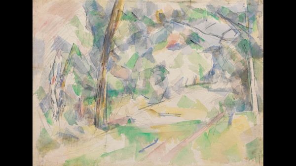
Apart from a Degas, which is going to get a post all to itself once I've sorted out in my head how I feel about it, for me the stars of the show are the Cezanne watercolours which are breathtaking in their subtly and vibrancy (and that, dear reader, is a hell of a combination to pull off). They look very, very modern to the point where one might imagine somebody today doing something very similar in Photoshop and producing a similar effect. Tree trunks in sharply defined graphite mixed with strange ethereal foliage in many colours and shades are amazing - they are absolutely a representational image...but they're also just so abstract at the same time.


I loved this one - "Paths, Trees and Walls" from 1900


It's a great show and well worth catching if you can

There's a really good review with lots more information on the Perlman collection on the FT Website, and the website of the Perlman Collection itself

Friday 23 May 2014

Ruinlust (Tate Britain)

Okay, so I'm way behind with writing these reviews..

I went up to Tate Britain, the 'old' Tate Gallery building on Millbank, to see the Ruinlust exhibition: " the mournful, thrilling, comic and perverse uses of ruins in art from the seventeenth century to the present day" it says on the website. As a great enthusiast for ruins in art and photography, and in fact ruins in general, I thought I had to give this one a go.

It's not a big exhibition, but it's a good one  The usual suspects are there of course - paintings of Tinturn Abbey and a bit of Piranese - but of course an exhibition like this needs them to be anything like complete. It was nice to see them up close too as you can see all the detail. There was also lots by artists I didn't know and by allowing the concept of 'ruins' to be quite loose the curators brought in some nice stuff which was more about urban decay I thought than ruins in the strict sense of the word.  As a major bunker enthusiast I loved the huge image by Jane and Louise Wilson of an Atlantic Wall bunker at Azeville which features on the poster and which is even more impressive 'on the wall'. If you look at other, purely representational, photos of the Azeville battery such as this one you realise the extent to which this photo is every bit as much an artistic representation of a ruin as Turner and Tinturn is!

If there was something which I thought was missing, it was anything representative of the Urbex movement which so powerfully captures ruins in modern photography, and which I thought would have been essential

Monday 31 March 2014

In praise of comic books

It's possible to forget that superheroes come in comic books: not just in blockbuster films. Every week, for years, it's been possible to find brilliant visual art on the shelves in newsagents, or more often these days online, for less than the proverbial price of a pint. I grew up on these things, and over the last year I've began to read more and more of them again, and to be delighted and amazed at the visual quality of them. The one I'm most taken with at the moment is the Marvel 'Black Widow', with drawing which contrary to the name seems almost devoid of any black: if things are outlined at all it's done in a very unsaturated red. In fact the entire series is very unsaturated with little of the punchy colours normally seen in comic books (the work of artist Phil Noto). It's a visual delight.

I grew up on comic books, in fact superheroes were one of the first things I can remember wishing I could draw. I can still after 30+ years remember some of the visual images from those comics because they were so powerful. Did I appreciate things like page choreography then? Not by name no but I was pulled along through the story. I found them exciting and enthralling which is what we want from art and design.

Is it art? You bet. Is it design? Totally Is the world a visually better place for comic books? Definitely


Wednesday 26 March 2014

Sculpture - turning a moment in time into something solid

I've just been watching a program in the BBC series 'What Do Artists Do All Day' with Antony Gormley the sculptor. It was fascinating, as are all the programs in the series, and he had a lot of interesting things to say: his website has a lot of reading matter about his thoughts as well as images of his work (look under 'resources') if you're interested.

The thing which struck me was a comment, and I can't actually quote this properly, along the lines of sculpture being about taking a fleeting moment in time and turning it into something adamantine. I loved that, the idea that when we look at a sculpted figure what we're looking at is a fraction of a fraction of a second which has been turned into something permanent which isn't going to change for decades, if not centuries. It's a joke that in Bernini's Ecstasy of St Theresa the poor girl has been five seconds from finishing for 350 years now, but it's true of any sculpture..or indeed of any work of art either figurative or abstract.

Why does nobody seem to praise the production designers?

TV, it's a visual medium right? 

So when we get a new series the critics and the public talk about the cast, and sometimes about who wrote it, but on the whole not about the production designers. Which given that they're the ones who make a program look as it does is just all wrong.. The 70s TV show 'The Fall Guy' used to have the tag line "I'm the unknown stuntman who makes Eastwood look so fine". There are equally unknown art and design folks who do the same for tv programs.

Go on, think of a show you love...name the stars....name the script writer....now name the production designers. Hey I can't do it either because by the time their names go by on the credits the writing is quite small and it's going by fast. At least with the advent of the special edition DVD there is now a chance that there's going to be a feature item on the production design so we not only get to see the people who make things look as they do but hear why. 

So this post is a shout out for the people who make our favourite programs look the way they do - so I'll go for two of my favourites

Musketeers - BBC, 2014 - production designer Will Hughes-Jones

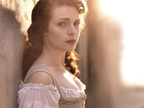
Okay, so I'm not convinced that 17th century France really looked like that, though it might have been close, but every moment is lovely to look at. The colour palette is always right and brings out the light, and the costumes and hair (by Phoebe de Gaye and Anne Oldham respectively) are to die for!  I love this program.


Bron | | Broen (The Bridge) - 2014 - production designer Søren Gam (info from IMDB)

So monochrome (apart from the very occasional splashes of colour which make you realise just how monochrome it is) and yet so visually absorbing, like a great monochrome photograph. And the Oresund Bridge itself is such an amazing structure when it appears curving away in the background of shots. The show is also a delight for all devotees of Scandinavian Interiors, and which of us do not look at the interiors of apartments in Scandinavian dramas and not want to head for our nearest branch of Ikea :-)


So, let's hear it for the production designers, art directors and costume designers who make good tv look so brilliant!

Sunday 16 March 2014

'Modern Architecture' - yes please

I live in the Cotswolds, don't get me wrong it's lovely round here and visiting Americans say that this is how they all imagine England to look. We've got a mill pond and a market square and lots of buildings in that honey coloured stone dating back decades if not centuries. It's lovely.

But does that mean we can only have buildings like that? Cotswold stone buildings look how they do because they're made of cotswold stone, you know, the stuff they mine all round here. Real rocks, dug out of real geological seams and used to build real houses because for centuries that was the easiest building material if you wanted something more substantial than wood, straw and cow poo. Now all the buildings are made out of reconstituted block which in my more generous moments I think are made of cement and cotswold stone dust and in my more realistic ones are made of cement and some colouring. Not only that but all the new building is designed to look like older building, to blend in because that's how the buildings of the cotswolds are supposed to look, because it's the look of the thing. But actually it's just making the place look a bit like a model village with hundreds of pastiche buildings. They look okay, but as yet another development goes up in the same colour and with the same mock georgianesque porch and mock dry stone wall round the garden I rather long for something which makes me go 'holy shit that's breathtaking'.

There's no need for 'vernacular' building now, we can source a whole range of materials pretty much anywhere, we don't have to opt for local stone any more...let alone something from a block factory somewhere shipped here by lorry in the right colour. I'm not saying that we need a huge and looming example of 60s brutalism, or a tube-covered hi-tech edifice, or a soaring bit of homage to the International style - but could we have something original and interesting? There's a lovely estate of luxury second homes (designed by Phillipe Starcke no less) nearby which are non-intrusive but not remotely pastiche cotswolds. Okay they're really expensive and not at all 'affordable' housing, but why can't we have this sort of imagination and design in all the new building in the district? Why can't we have a combination of glass and steel and some stonework in the cotswold colour to provide some context?

Why can't we have something new?
Wednesday 12 March 2014

Introduction

So this is my new blog, which I've managed to title after days of coming up with names and finding that somebody else has already used them (usually in 2002 and only posted once). But here it is - VisuPulse.

So what the heck kind of word is that?

It's the kind of word you come up with when you're going to blog about art, design and other visual creative stuff and every real word related to those topics has been used as a blog title (see above). We're also currently only running with a default template because I've not done the design for the blog yet - I enjoyed doing my son's twitter channel (@ironhybrid) and so I'm naturally going to create my own for this blog - after all I live and breath for photoshop.

So, hopefully the next post will be a real 'topic' one.